Signal over noise.
The design for a 10-second decision.
Industrial dashboards should act like a high-performance flight deck, stripping away the noise to show exactly how a facility is breathing. By blending real-time health metrics and production rates with energy patterns, the interface turns raw telemetry into a clear narrative of operational uptime and efficiency. It’s about moving past simple monitoring into proactive maintenance, using smart alerts to catch friction before it becomes a failure.
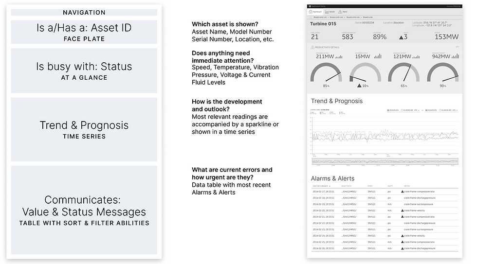
The real power lies in the transition from a bird’s-eye view to a deep dive. With intuitive filtering and drill-down tools, users can isolate specific shifts or historical trends to see exactly where the logic breaks down. By allowing for custom thresholds and instant access to archived data, the design stops being a static display and becomes a dynamic tool for gut-checking performance and making calls in the moment.
Industrial Asset Dashboard
Industrial dashboards should function like a high-performance cockpit: they filter out the noise and show precisely how a system 'breathes.' By linking real-time status data and production rates with energy consumption patterns, the interface transforms raw telemetry into a clear narrative about operational safety and efficiency. The goal is to go beyond pure monitoring and enable proactive maintenance — where friction losses are detected through intelligent alerts before they lead to failure.
COVID-19 Surveillance Dashboard
This dashboard moves away from the "noise" of global crisis reporting to provide a clean, high-fidelity look at pandemic data. By using a modular design and a strict visual hierarchy, the interface ensures that critical transmission rates and health indicators remain the focal point across any device. It’s a study in responsive information architecture, where color and placement do the heavy lifting to guide the eye toward what matters most.
The strength of the system lies in how it balances real-time tracking with long-term trends, using customizable widgets and clear color-coding to make sense of complex datasets. Whether comparing historical waves or monitoring current performance ratings across regions, the integration of interactive maps and charts allows for a seamless transition from global overviews to local specifics. It’s about giving the user a precise, functional tool to audit the data on their own terms.

COVID-19 Surveillance Dashboard Detail Page
To complement the global overview, the regional view functions as a high-fidelity "zoom" into specific territories, delivering critical local data at a glance. By maintaining the same strict visual hierarchy and color-coding, the interface allows for an instant pulse-check on a single location’s real-time tracking and performance ratings. It’s designed to isolate the signal from the noise, ensuring that local trends remain the priority without losing the broader design logic.
This localized perspective excels at contrasting historical benchmarks against current performance, providing a clear narrative of how the situation is evolving on the ground. Through a clean, responsive layout, the regional view transforms complex location-based data into a functional tool for comparison and analysis. It ensures that whether you are looking at a single city or a wider district, the most important indicators are always front and center.
