
General Electric:
Predix UI Design System and code library
Creating a design system for the Internet of Things is a little bit different from your average eCommerce web site. First of all, we knew nothing. Secondly, we needed to ask a lot of questions. And thirdly, all our solutions appeared to be temporary because new evidence surfaced constantly. There were no other design systems to copy from, so we had to make it up as we went.
My role: I was the lead designer, collaborating with two junior designers, eight developers, a product manager, and a writer.


The challenge
Previously a high-quality user experience and front-end implementation was hard to maintain. The skills of teams were wide-ranging, with competing priorities, and a diverse design community with varied use cases. Users in dark environments had gone unconsidered, the data visualization palette was generic, and the MVP lacked the refinement needed to serve all users effectively, including those with accessibility needs.
The requirements
We aimed to design a visually appealing, robust UI backed by user research. The system had to foster collaboration between designers and developers, with a flexibly that accommodates a broad range of use cases, and meets both optical and accessibility standards.
The creative solution
We delivered iteratively. It began with a minimalist MVP built around essential components, a clear visual hierarchy, and a straightforward design language to keep things simple, functional, and effective. From there, the team tackled dark environment usability, finding that dark colors with a subtle blue tint best reduce eye fatigue while elevating visual appeal. This informed a new 30-color data visualization palette, carefully selected to support both line and area charts with strong clarity and distinction. In the final phase, the design was further refined to introduce a flexible global navigation system, a reimagined approach to dark and light theming, revised data visualization colors, sufficient font contrast, and keyboard shortcuts within components — ensuring the product works for color-blind users and meets baseline accessibility requirements throughout.
BEFORE

The IIDS Design System developed by Frog Design looks promising but lacked rigor and wasn’t easy to apply.
The Problem
The original Predix Design System MVP was built around a single product line and a minimal style prioritizing speed of delivery. As GE acquired more products and teams, the system felt inflexible and lacked visual impact.

An APM dashboard in the Style of the first MVP
Community-First Approach
Rather than redesigning in isolation, the team leaned heavily on the broader GE design community. They conducted a series of six workshops covering navigation, page layout, color, materiality, data input, and data presentation, bringing together designers from different teams to share use cases, highlight challenges, and brainstorm solutions.

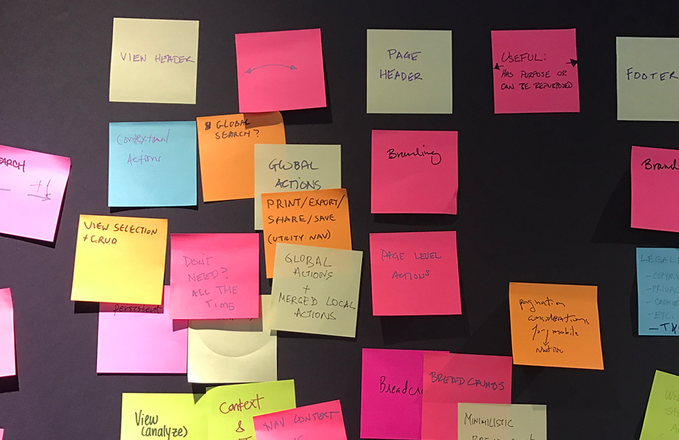

The Key Decisions
Color
A shift from warm to cool neutral tones, informed by GE's Healthcare team research, with an expanded data visualization palette for more expressive charts.

The custom color wheel. A subset of these colors are used for data visualization colors.
Materiality
Dark and light themes were combined rather than kept separate, doubling the core color palette and giving teams more flexibility.

Twenty grays that inform both dark and light theme.

Accessible combinations for type and UI elements
Layering
Animation & Layering: A structured layering system was introduced to reinforce visual hierarchy, along with subtle motion for navigation menus and transitions.

Recommended type / background combinations for page layouts

Scematic overview of the recommended combinations for page layouts

Decorative illustration showing UI elements sporting the new colors on dark and light backgrounds.
Iconography
A custom SVG icon set replaced the generic open-source icon font, better suited to industrial use cases.

Examples of icons in the new style.
Typography
We would definitely choose type sizes and spacers divisible by 8.

Forms
[...]

A simple Form with rythmic spacers.
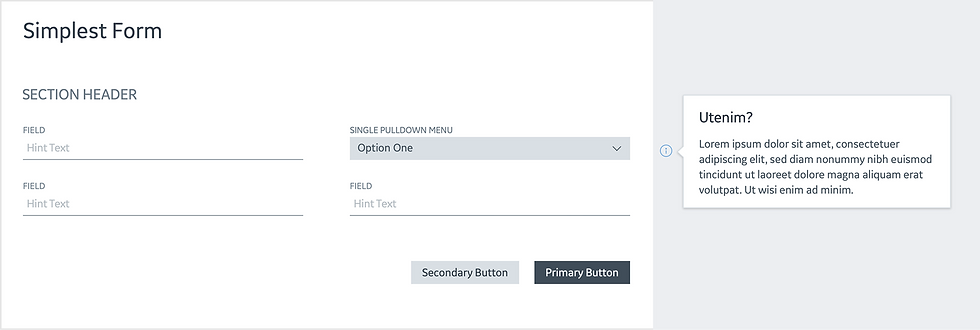
The same form in its simple beauty.

The more complex form proportionally spaced and easy to scan.
Guidelines
[...]

The homepage for the "Cirrus" release of the Predix Design System.
The Happy End

The new style in action